Consistent campaign images with AI
Build a visual brief, anchor your references, and review a campaign as a set instead of chasing isolated AI images.
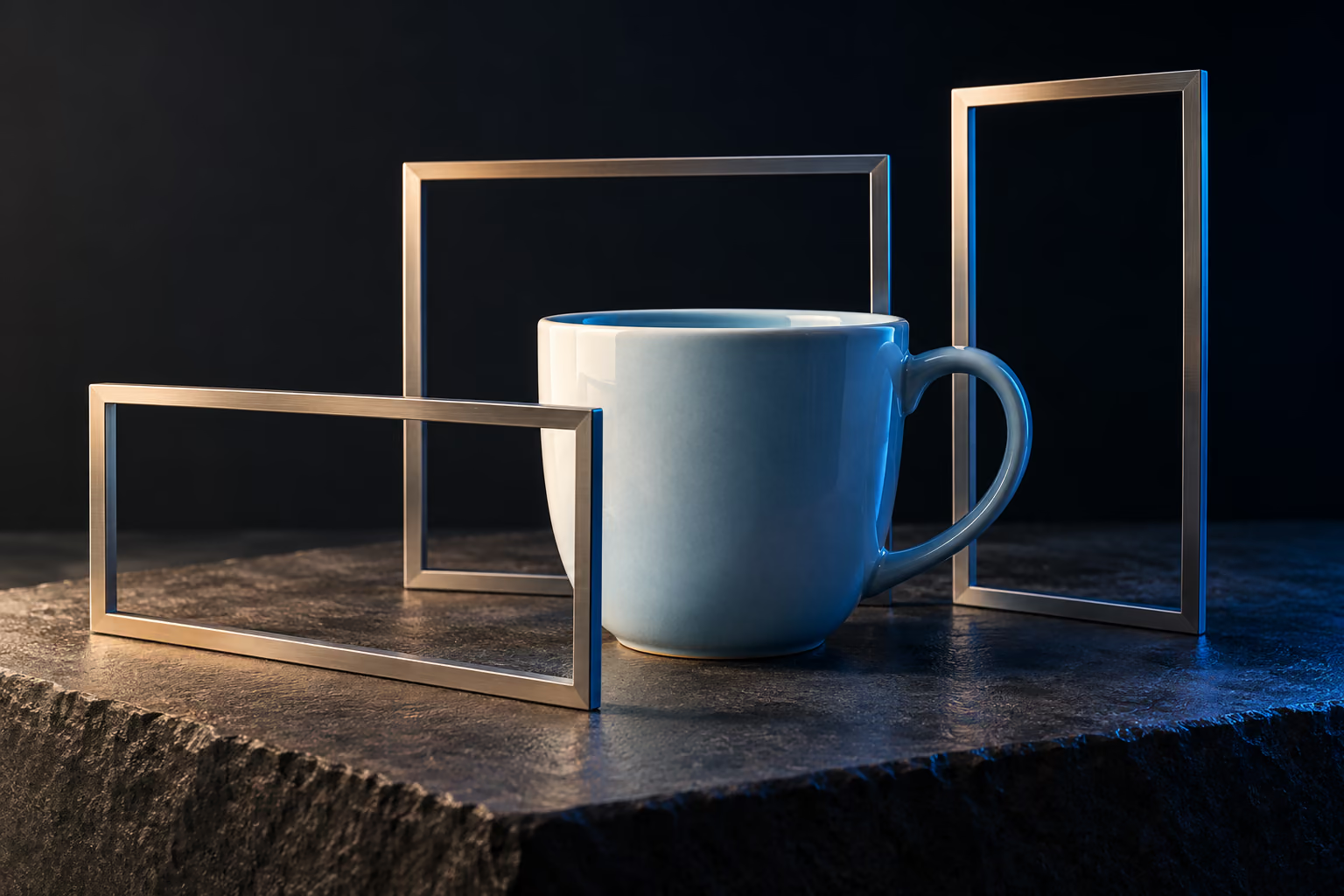
One beautiful AI image is easy to mistake for a campaign. Put it beside the next five and the problem becomes visible: the lighting changes, the product changes shape, and each image belongs to a different brand.
Current image tools offer more than generating a fresh picture from text. For example, FLUX.2 supports editing with reference images. That gives you ways to carry visual decisions forward. It still takes a brief and a review process to produce a coherent set.
Start with a visual contract
Write down the decisions that must survive every variation: subject, palette, lighting, camera distance, background, and space for copy. Separate those from what can change, such as the crop or angle.
Here is an illustrative brief for a fictional ceramic cup launch:
- Subject: one unbranded pale-blue ceramic cup, with the same handle and proportions throughout.
- Environment: warm neutral tabletop, soft side light, restrained shadows.
- Composition: product on the right, clear copy space on the left.
- Deliverables: a website hero, a square social post, and a portrait story.
- Fixed details: material, colour, handle shape, and camera character.
For a real product, begin with accurate product photographs. A generated approximation should not become evidence of an item’s finish, capacity, or construction.
Approve one anchor before making the set
Generate or edit a small number of directions, then select one anchor image. Evaluate it against the brief before you approve it. Keep the input references, prompt, selected tool and model, and accepted output together.
Different tools interpret references differently. Identify which image supplies the subject and which supplies the style in your instructions. Keep the references relevant; an unrelated mood board can introduce decisions you never intended.
Use the approved anchor to guide later variations where the tool supports it. Avoid rewriting the whole prompt for every asset. Preserve the contract and change one instruction at a time.
Change the crop, not the identity
For the cup campaign, a square post may need a tighter arrangement while the website hero needs more empty space. Ask for those changes explicitly. Do not ask for “another exciting version” and hope the product remains intact.
Preserve the cup’s colour, handle shape, proportions, tabletop and lighting. Adapt the composition to a portrait frame, with clear space above the product for the headline.
This is a sample editing instruction, not a guarantee of preservation. Inspect the result. If the handle changes or the material drifts, correct that variation before you build more assets around it.
Put every output on one review sheet
Look at the campaign as a group, at the sizes people will actually see. A defect that is invisible in a thumbnail may dominate a product detail page. A delicate image that looks wonderful at full size may collapse on a phone.
- Identity: does the subject remain recognisable across the set?
- Visual language: do colour, light and texture belong together?
- Composition: is there usable space for each placement’s copy?
- Accuracy: are product details and visible text correct?
- Finish: are edges, reflections and shadows convincing at delivery size?
Reject weak variations. Consistency does not mean accepting six mediocre images because they share a palette.
Finish typography and keep a record
Place final headlines, logos and required information in your design layout, where you can control alignment and edit exact wording. Export for each placement instead of serving one oversized file everywhere.
Keep a short handover record: the visual brief, references you have permission to use, the accepted assets, generation settings, and any manual edits. Review the relevant usage terms for the chosen service and model before a commercial release; the same broad tool name can cover different models and conditions.
A coherent campaign comes from decisions you preserve and mistakes you catch. The tool increases the number of possibilities. Art direction gives them a common purpose.
Sources and further reading
Product documentation checked on 2 October 2026: Black Forest Labs: FLUX.2 image editing and references. The ceramic cup brief is a fictional worked example. The editorial artwork on this page is not a documented tool comparison.